BU After School
Creating a visual identity and digital assets for a student-run newsletter at Boston University.
Discplines
User Research
Brand Strategy,
Visual/Brand Design, Copywriting

Tools
Adobe Photoshop
Timeframe
2 weeks
( Jan 2021)
overview
As Branding VP for BU After School, Boston University's Student-run newsletter, to enter the competitive club recruitment cycles and return back to an in-person semester, I collaborated with a team of 5 designers and researchers to rebrand the club, created a brand guideline, design branded collateral and launched social media campaigns. Through these efforts, we increased applications by 34%, generated a 24% increase in opening rate, a 13% increase in read through rate,  and a 5000+ growth in subscribers.
jump to solution
process
Understanding BUAS
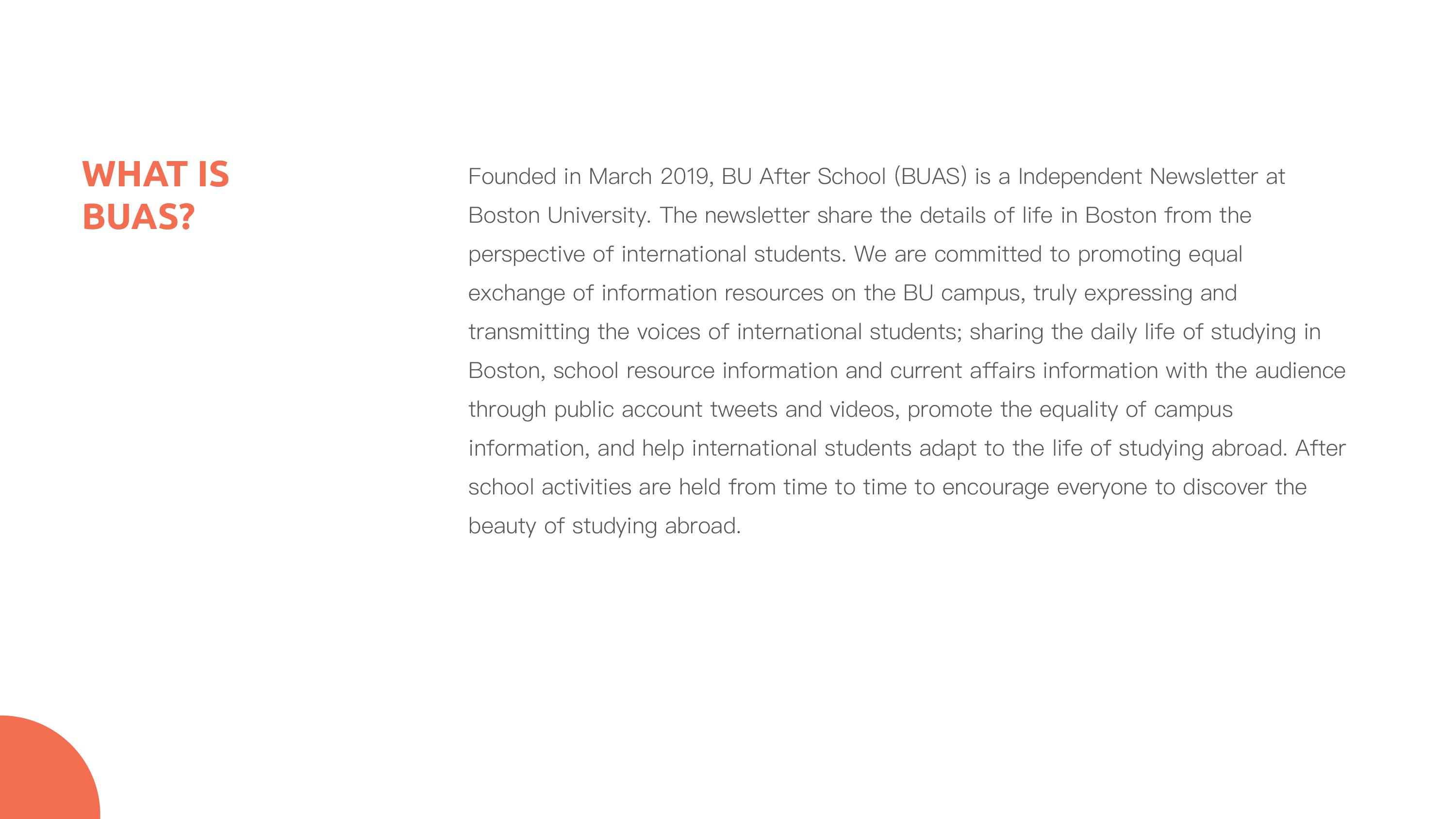
01|what is BU After School
To help define and communicate the brand, we first summerizes how BU After School currently defining itself by interviewing the presidents and members.
02|researching brand strategy & positioning
We analyzed our target audiences and competitors to further identifying  the needs of people that we are communicating to and gather some idea of how to differeientate ourself with others.
03 | identifying strategy & goals
To help define and communicate the brand, identifying any issues I see and help the client succeed.  we found the areas that are working, and those that can be improved.
Defining Our Design Goals
After gathering interviews, research, analytical data, It's time to narrow our design goals addressing on weaknesses and enhancing strengths.
Designing Style Guide
To the entire identity system supporting the brand messag, we start designing a visual approach with the logo.
Considering the diverse categories of contents that we posted across all platform, we matched a category of content to a color. All together the colorful imagery also response to our diversity.
Printed Assets
Teaming Pictures
Final thoughts
The five of us worked on this project during spring break in the last semester in BU After School. We worked with the hope that this guideline could provide something meaningful to members in other departments and giving directions to upcoming designers, or art directors to oversee future works. Throughout the process, what surprised me the most were the results of the implementation process. We realized the constraints of certain designs. For example, as we are later implementing the color palette to article layouts and other digital assets, the theme of the article sometimes did not fit with the color of the categorized articles. I learned to be more flexible with the implementation, communicate and evolving the brand guideline with designers to create continuity across  posts despite differences in content and visuals.